







Dark Mode Design: Adding a Dark Theme to Your Website
A dark theme is more than inverting colors. We cover what to watch in dark mode design, including contrast, shadows, images and managing user preference.

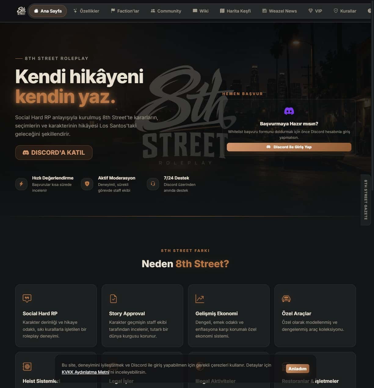
Since phones and operating systems started offering dark themes, many users want to see websites in this mode too. But putting a dark background behind white text is often not enough; colors, shadows and images need rethinking. This article gathers the key points for building dark mode properly.
Why do people want a dark theme?
Users may choose a dark theme to reduce eye strain in low light, to save battery or simply out of visual preference. It is not essential for every site, but adds value to dashboards, reading-heavy content and tools used in the evening.
Avoid pure black and pure white
Pure white text on a pure black background can tire the eyes because of the sharp brightness difference. A dark gray surface with slightly off-white text is often more comfortable. Still, verify by measurement that contrast ratios do not drop below accessibility limits.
Re-tune your colors
A saturated color on a light theme can glow too much on a dark surface. Prepare a lighter or less saturated version of your accent colors. Test status colors such as success, warning and error separately for both themes.
Create depth with layers, not shadows
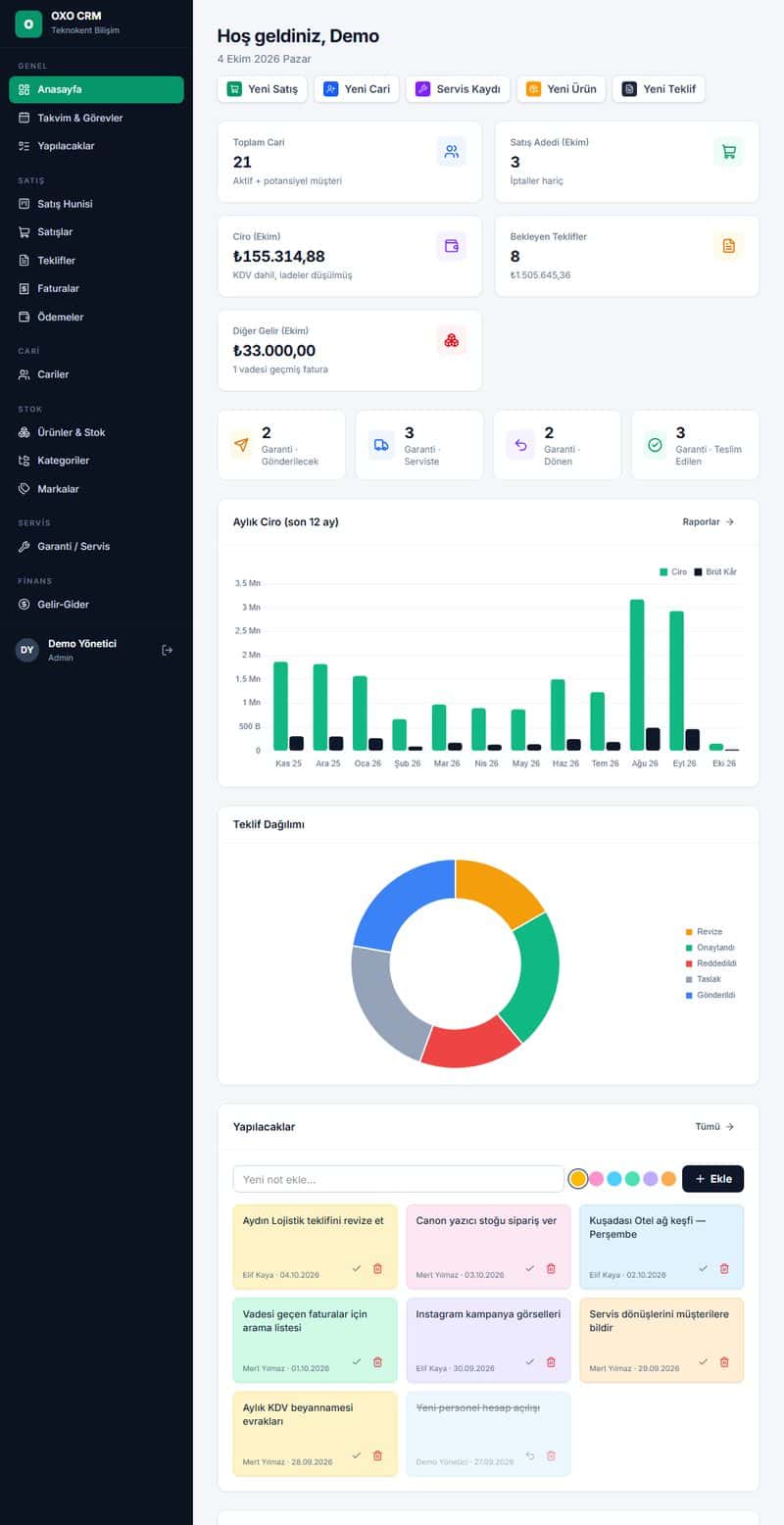
On light themes shadows add depth, but on dark surfaces they are nearly invisible. Instead, separate cards and panels with colors one step lighter than the background. This keeps the hierarchy between surfaces intact.
Images and logos
Images with white backgrounds stand out badly in a dark theme. Prepare logo versions with transparent backgrounds and use single-color icons that take their color from the theme, for example SVG. Slightly reducing photo brightness can also improve harmony.
Manage user preference
There are technically two layers.
- Automatic theme selection based on the browser's prefers-color-scheme setting.
- A manual theme toggle on the page, with the choice saved.
- Reading the preference early to prevent the theme from flashing while the page loads.
Easy management with CSS variables
Instead of writing colors directly into components, define them as CSS variables. When you define separate value sets for the two themes, components adapt automatically and maintenance becomes much easier.
Test it
Forms, tables, charts, error messages and embedded third-party content can break in a dark theme. Walk through all main flows in both themes and check on both phone and desktop.
In short, a dark theme is a separate design effort. Try it first on the most used pages, gather user feedback and then roll it out across the site. This lowers effort and the risk of errors, and users feel they have a choice. Keeping the theme preference consistent across devices is a nice detail too.
If you would like support deciding what to do with your site, get in touch or browse our services.