





Landing Page Design Principles: Guiding Visitors to Act
A good landing page focuses on a single goal. We explain the design principles that guide visitors to act, from headlines and forms to visuals and trust elements.

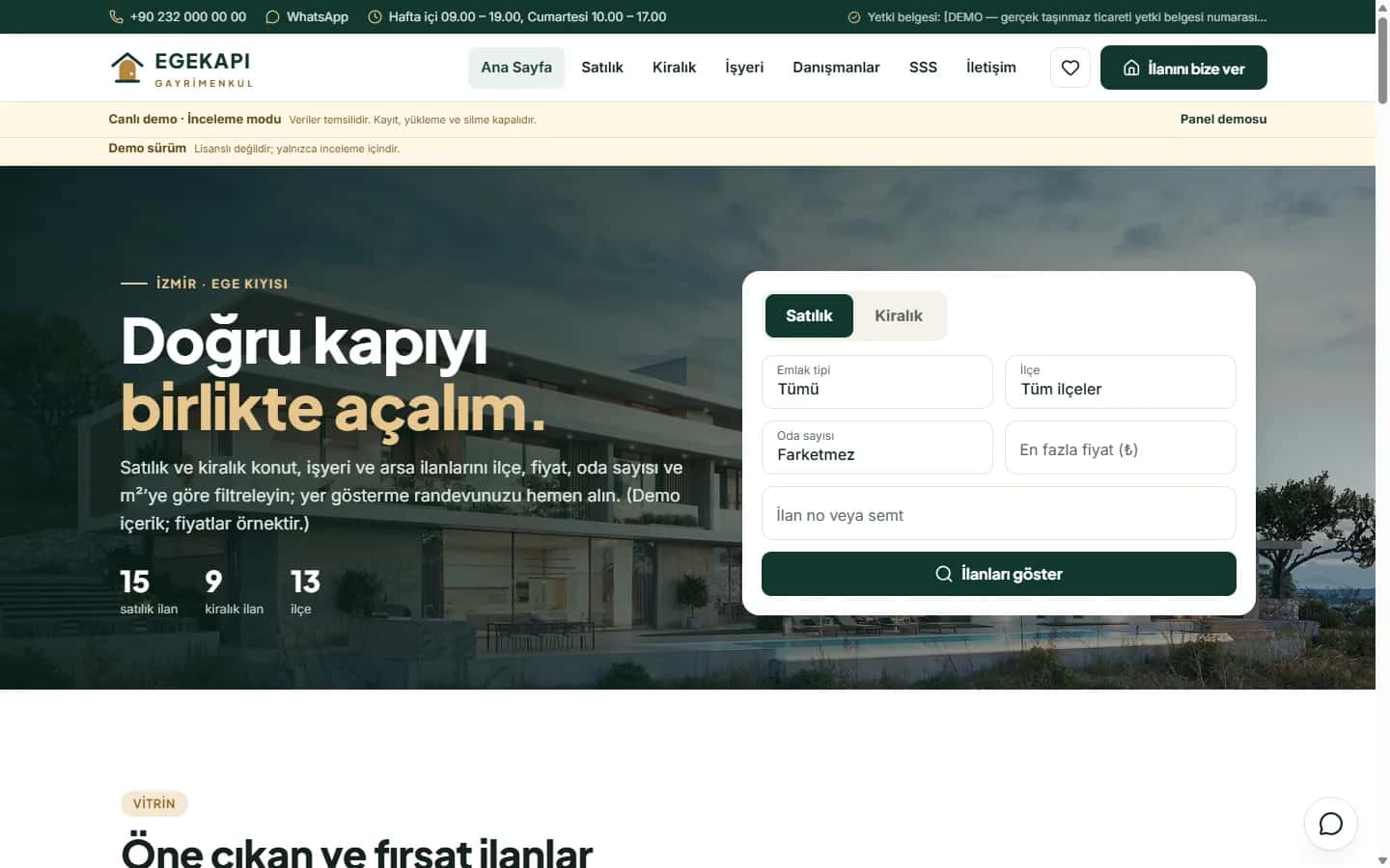
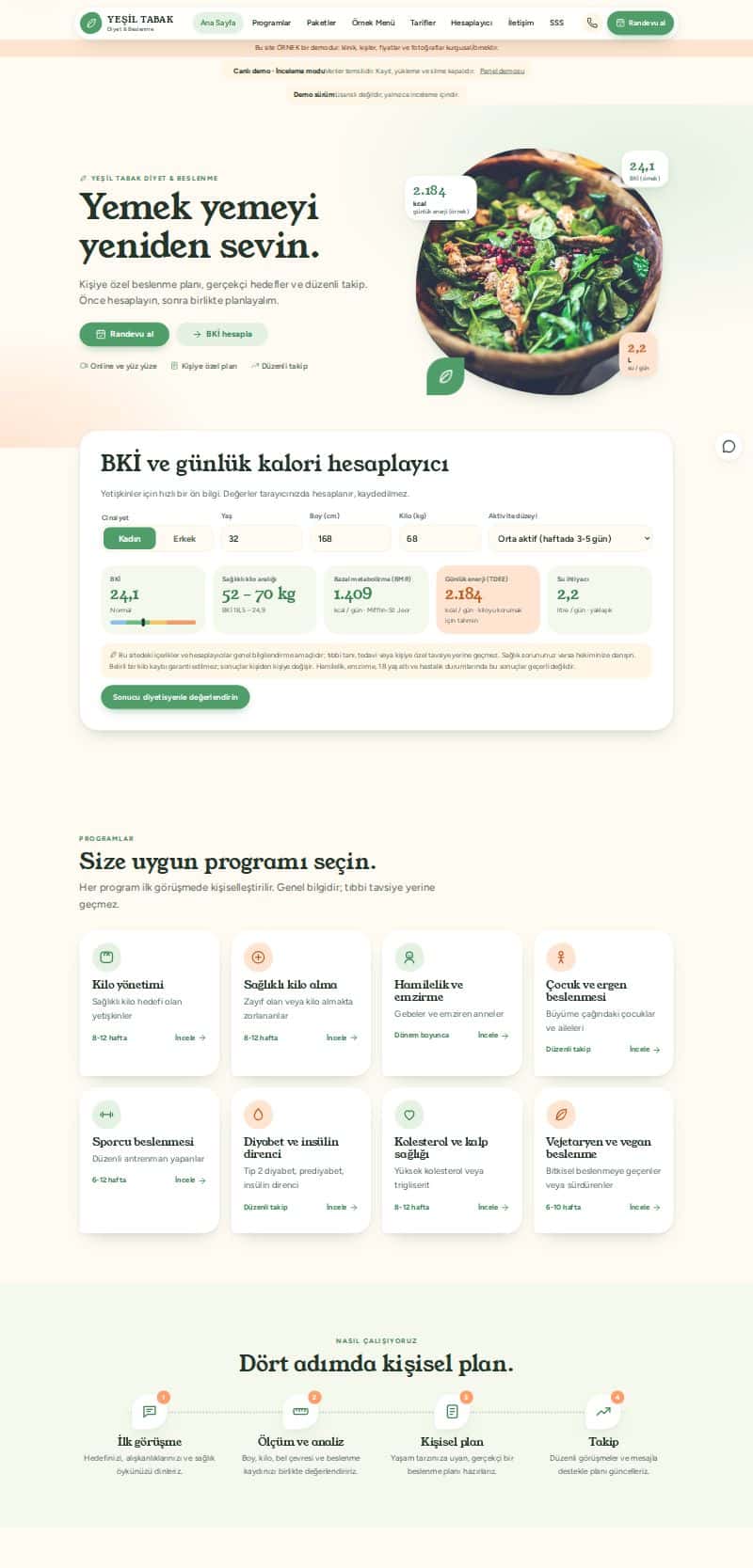
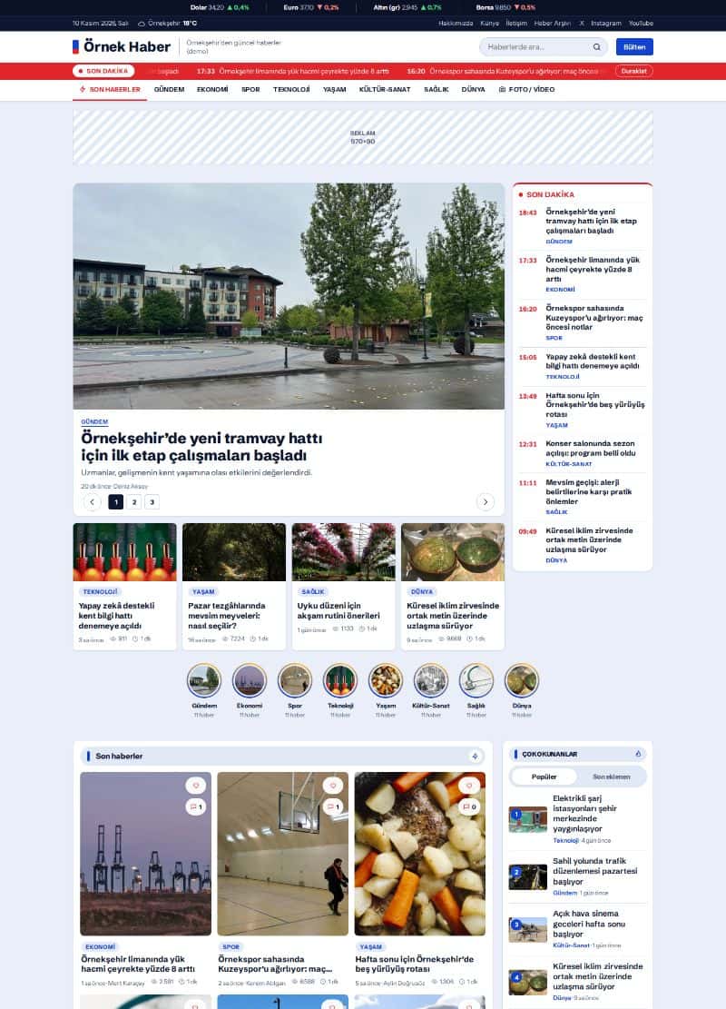
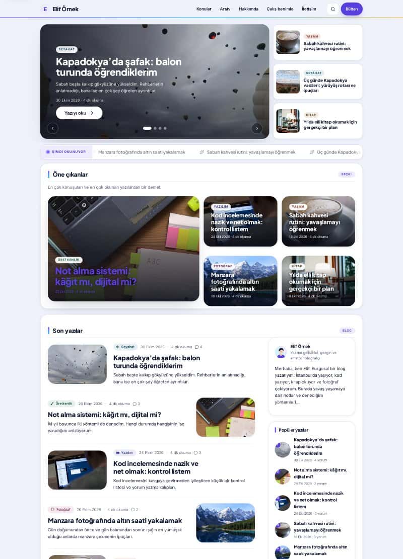
A landing page is built so that a visitor arriving from an ad, an email or a search result takes one specific action. Unlike a home page, it avoids distraction from menus, many sections and dozens of links and focuses on a single goal. The principles below work for most businesses regardless of visual taste.
One page, one goal
Every landing page needs a single purpose: filling in a form, requesting a quote, booking an appointment or downloading a file. Adding a second goal leaves visitors unsure where to focus. Before designing, write this down: when this page succeeds, what exactly will the visitor have done?
A clear headline that makes a promise
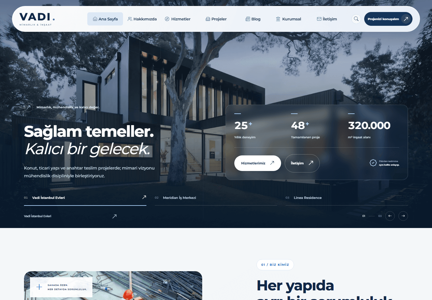
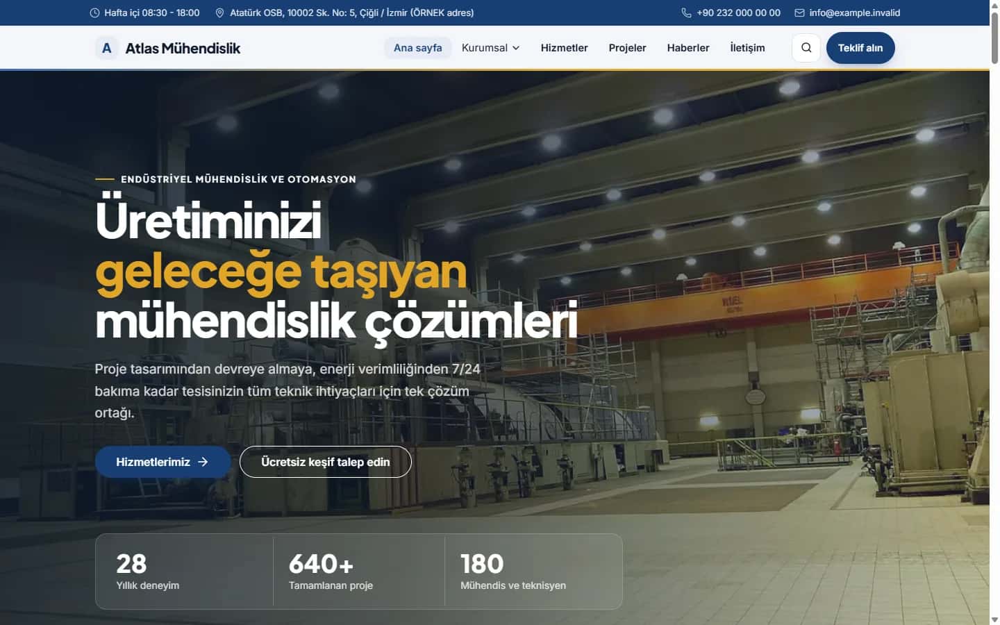
The headline should let a visitor confirm within three seconds that they are in the right place. Keep it consistent with the promise made in your ad. Instead of clever but vague lines, say plainly what you offer and who it is for. Use the subheading for a short explanation or a concrete benefit.
A visible and consistent call to action
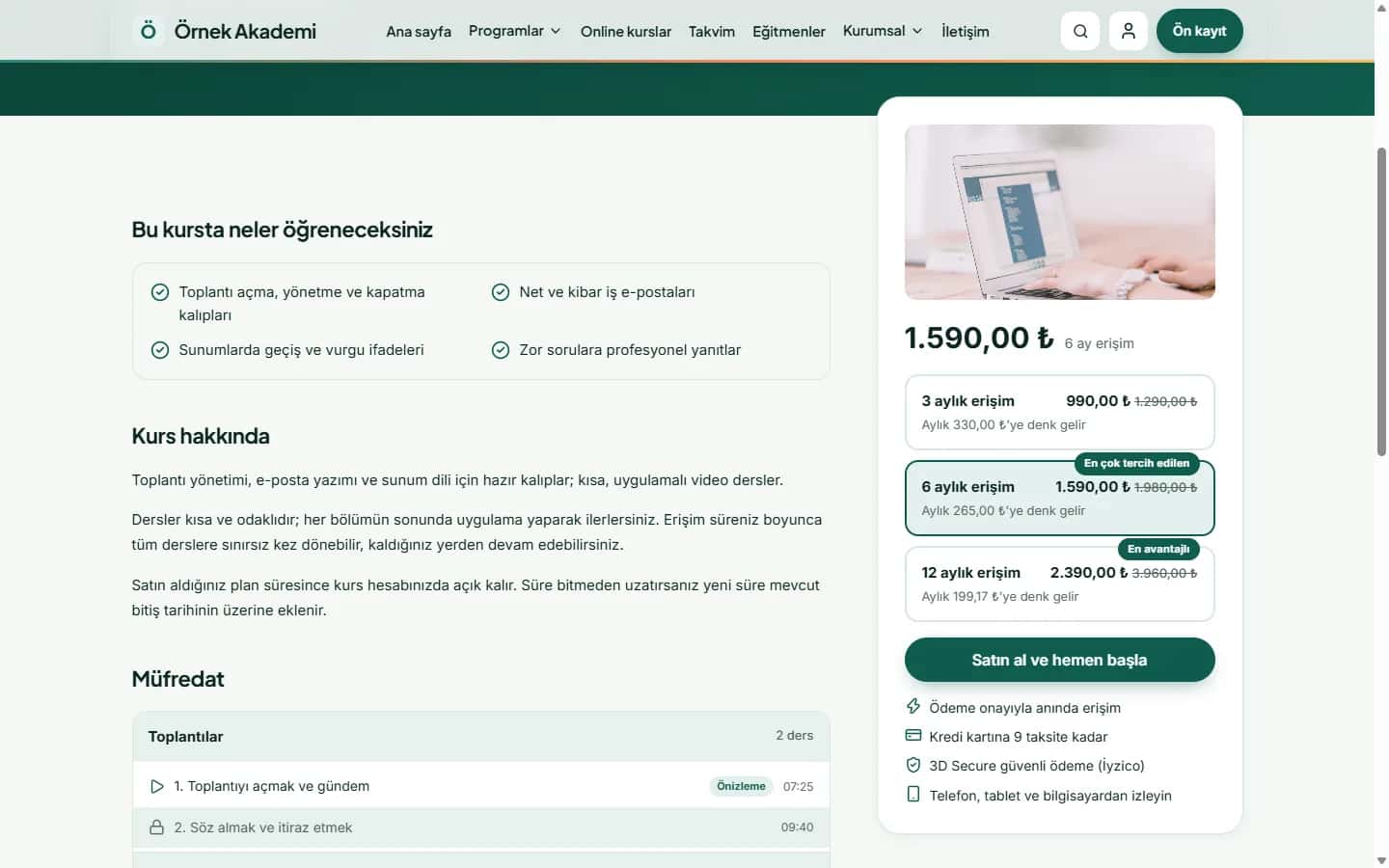
The call-to-action button should be one of the most prominent elements on the page. Use text that describes the outcome, such as "Get a free quote", instead of "Submit". You can repeat the button in several places, as long as every one leads to the same destination.
- Use a contrasting colour without breaking the site's palette.
- Make it large enough to tap comfortably on mobile.
- Leave breathing room around the button.
A short form that asks only what you need
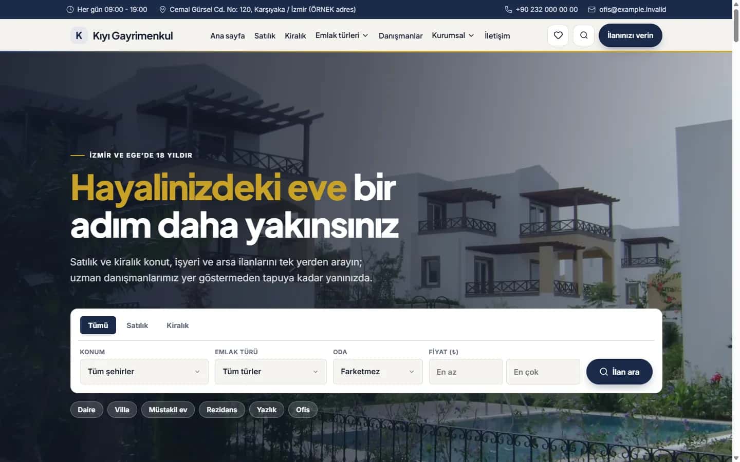
Every form field lowers conversion a little. Do not ask for information you do not truly need. Name, email and a short message are often enough. If a phone number is mandatory, explain why in one sentence. Write clear error messages and never wipe the fields the user already filled in.
Visuals that show the benefit
A visual should be part of the message, not decoration. Photos of your product, the result of your service or your real team build more trust than generic stock images. Compress images: a slow landing page wastes ad budget.
Trust elements
Visitors do not know you yet. Real customer reviews, sectors you work with, certificates, contact details and a privacy note build confidence. Avoid made-up or unverifiable claims and write only what you can show.
Think mobile and speed first
A large share of ad traffic arrives on phones. Design for the mobile screen first: headline and button visible in the first screen, text split into short paragraphs. Then run a speed test and remove unnecessary scripts.
Measure, test, improve
After launch, track form submissions and clicks. Test one change at a time: headline, button text or form length. Small, regular experiments usually give more reliable results than large redesigns.
If you would like support deciding what to do with your site, get in touch or browse our services.