






Micro-Interactions: Big User Experience Through Small Animations
A button changing color on hover, a brief shake on a form error, a progress bar while loading: we explain what micro-interactions are and how to use them well.

A button shrinking slightly when pressed, a heart icon filling in, a form field turning red on error: these are micro-interactions. Small on their own, they play a large role in making a site feel alive, understandable and trustworthy. Here we look at using them with purpose and restraint.
What is a micro-interaction?
It is a small, single-purpose response to a user action. It usually has four parts: a trigger (click, hover), rules (what happens), feedback (the visible change) and loops or modes (how long it lasts, whether it repeats). The aim is less to entertain than to tell the user "your action was received".
What are they good for?
Well-designed micro-interactions answer a real need.
- Communicating status: loading, saved, sent.
- Preventing errors: password strength indicators, live form validation.
- Guiding: gently emphasizing the key button.
- Giving satisfaction: a brief confirmation animation when an item is added to the cart.
Example uses on a website
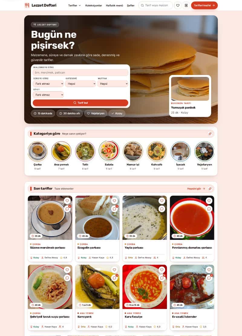
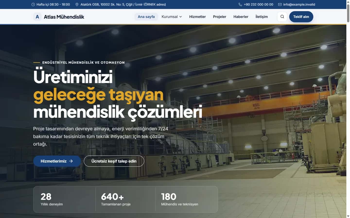
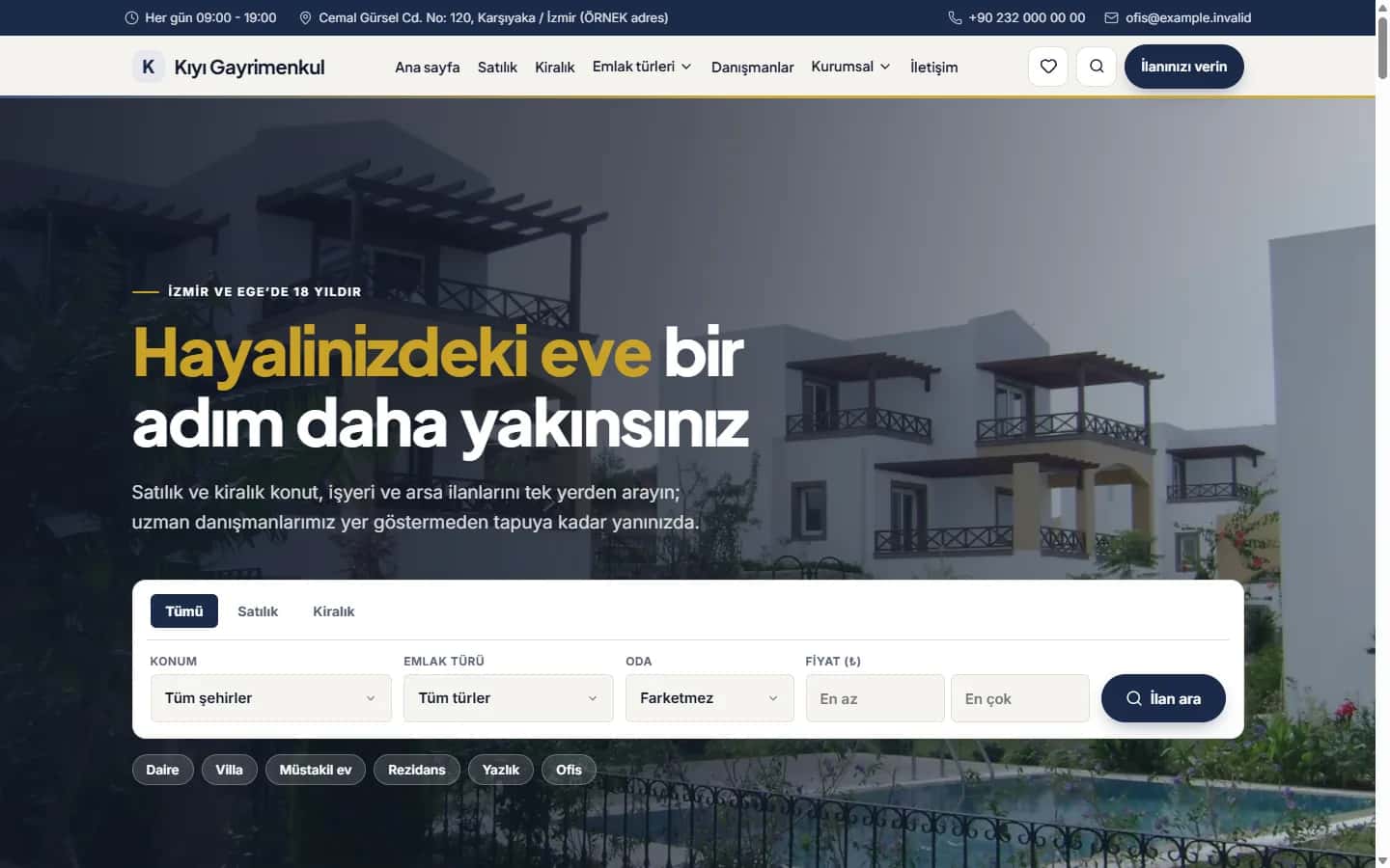
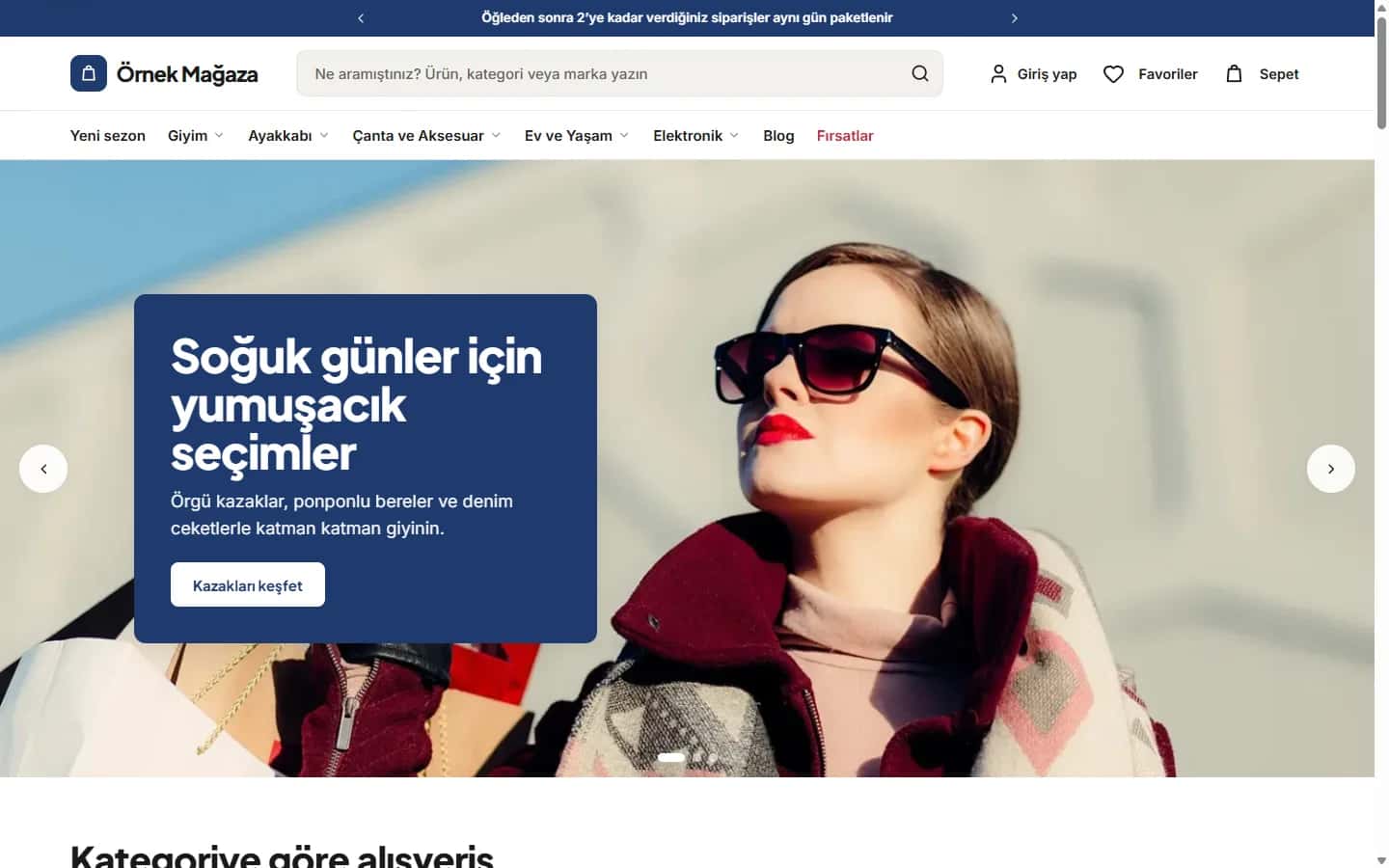
Common examples include a sliding panel as the menu opens, the cart icon count updating, a thank-you message after form submission, sections that appear on scroll and skeleton placeholders while images load. Each shows the user that the page is responding.
Duration and rhythm
Most micro-interactions should last between 150 and 400 milliseconds. Too fast and it goes unnoticed; too slow and users wait. Curves that start quickly and end softly feel more natural. Use the same motion for the same kind of action to keep things consistent.
Do not overdo it
If every element moves, attention scatters and the page becomes tiring. Before adding an animation, ask: what is this for? If the only answer is "it looks nice", consider dropping it. In serious steps such as payment, calm and simple feedback builds more trust.
Performance
Where possible, animate transform and opacity; they strain the browser less. Avoid animating properties such as width and height that force layout recalculation. Plain CSS is often enough instead of heavy libraries.
Accessibility
Some users are bothered by motion. If the operating system's reduced-motion preference is on, simplify or disable animations. Also do not convey information through animation alone; add text or an icon. For keyboard users, focus states should be visible too.
How to start
Identify the three most critical points on your site: the main button, the form and the cart or contact step. Add meaningful feedback to these first, then expand by watching user behavior.
Finally, review your micro-interactions from time to time. Remove those that no longer serve a purpose and keep the ones users clearly benefit from. Less but meaningful motion usually feels more professional than constant movement.
If you would like support deciding what to do with your site, get in touch or browse our services.