









Product Page Optimization: 10 Elements That Make Buying Easier
The product page is where visitors decide to buy. From images to shipping details, reviews to mobile experience, here are 10 elements your product pages should include.

Visitors may arrive from an ad, a search or a category page, but they usually make the final decision on the product page. If that page is incomplete, vague or slow, the money spent on traffic is wasted. The 10 elements below aim to answer one question quickly: "Is this right for me, and can I buy it safely?"
1. Images that show the product
First impressions come from images. Show the product from several angles, in use, and with a sense of scale. Compress the files and add alt text, which helps both page speed and search visibility.
- A clean background on the main image, real-life use in the extra ones.
- High-resolution photos that can be zoomed.
- A short product video when it makes sense.
2. Clear title, price and stock information
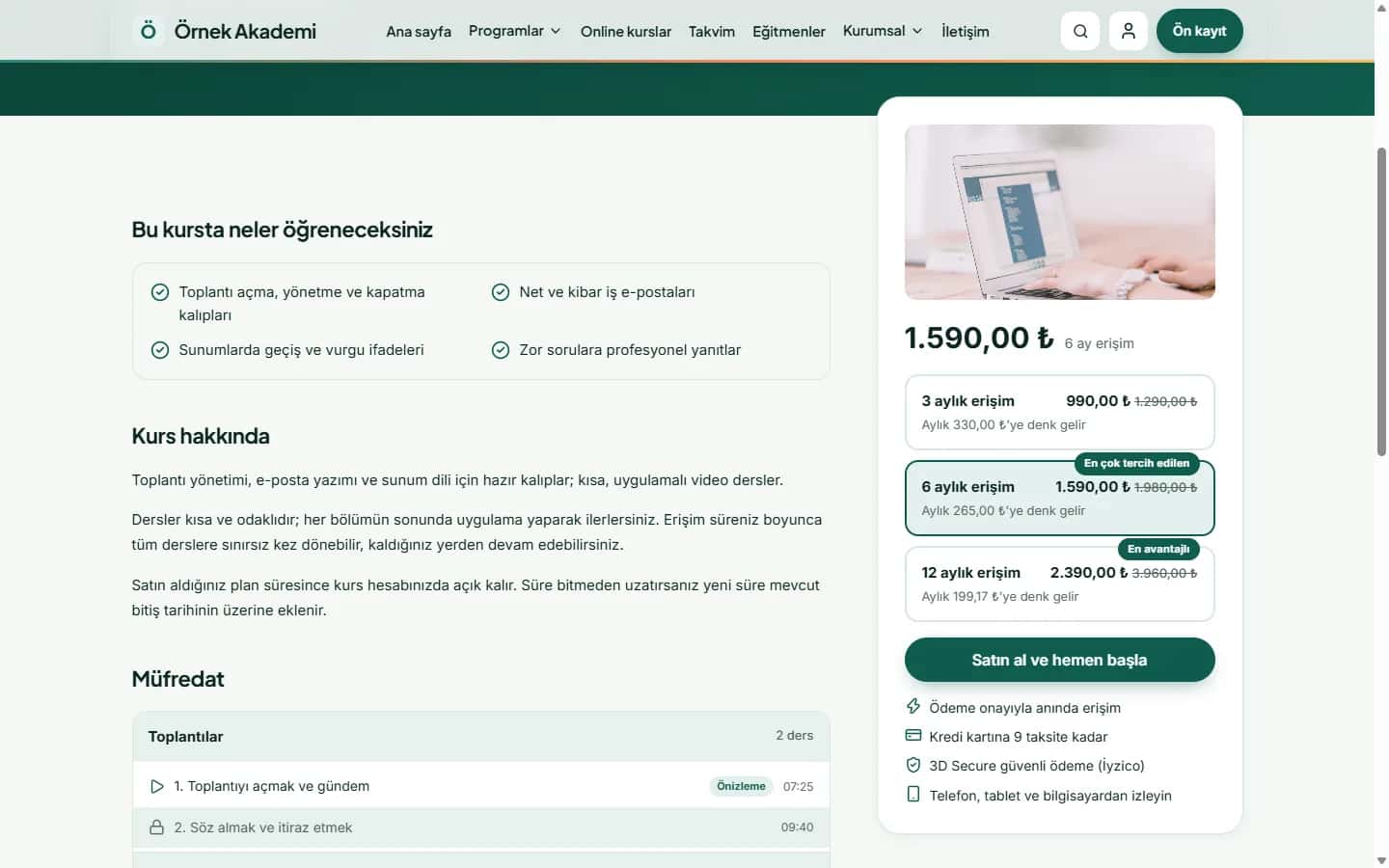
The title should state what the product is, including brand, model and a distinguishing feature. The price should be visible along with whether VAT is included, and discounts should not confuse the old and new price. Show stock status early: offering a "notify me when available" option for sold-out items keeps you from losing the customer completely.
3. A detailed, scannable description
People scan rather than read long text. Start with a short summary of the benefit, then list technical details in bullet points. Dimensions, material, compatibility and care instructions reduce the questions customers would otherwise ask. Writing an original description instead of copying the manufacturer's text also helps you stand out from other sellers of the same item.
4. Options and the call-to-action button
Size, colour and variant selection must be easy to understand, and if an option has not been chosen, the button should explain why it does not work yet. The "Add to cart" button should be prominent, and on mobile you may consider keeping it fixed at the bottom of the screen.
5. Shipping, returns and payment details
Many abandoned carts come from unexpected shipping costs or unclear return terms. Show the estimated delivery time, shipping fee and return conditions briefly on the product page. Mentioning instalment and payment options is especially useful for shoppers in Türkiye.
6. Reviews and social proof
Real customer reviews build trust. Do not fabricate them or show only positive ones; a balanced view is more believable. A questions-and-answers section also removes doubts before purchase.
7. Trust signals and mobile experience
SSL, secure payment badges, company details and visible contact channels increase confidence. Since a large share of traffic on most online stores comes from phones, test the page on mobile first: buttons should be easy to tap, images should load fast and text should be readable.
8. Related and complementary products
If the product is not a fit, offer alternatives; if it is, suggest complementary items. This reduces exits and raises the basket value naturally. Suggestions must be relevant, because a random product list is only a distraction.
9. Structured data and page speed
Marking up product, price, stock and rating information with schema.org Product data gives you a chance at rich results in search. For speed, compress images, remove unnecessary plugins and monitor Core Web Vitals regularly.
10. Measure and test
Instead of guessing which element works, measure it. Track the add-to-cart rate from product pages, scroll depth and exit points, and run A/B tests by changing only one thing at a time.
Conclusion
Product page optimization is not a one-off job but a continuous improvement loop. Close the basic gaps first, such as images, price, shipping and mobile experience, then move on to trust elements like reviews and recommendations. If you would like help reviewing your store's product pages, take a look at our e-commerce services or get in touch.