









Website Color Psychology: Choosing Brand Colors the Right Way
Colors influence feeling and perception, but there is no magic formula. Here is how to balance contrast, culture, industry and accessibility when choosing brand colors.

Color choice is often reduced to slogans like "blue builds trust, red creates excitement". In reality, the effect of colors varies with culture, industry and how they are used. Color psychology is not a rulebook; it is a guide to weigh while deciding. Here we look at color in a practical, website-focused way.
Meaning depends on context
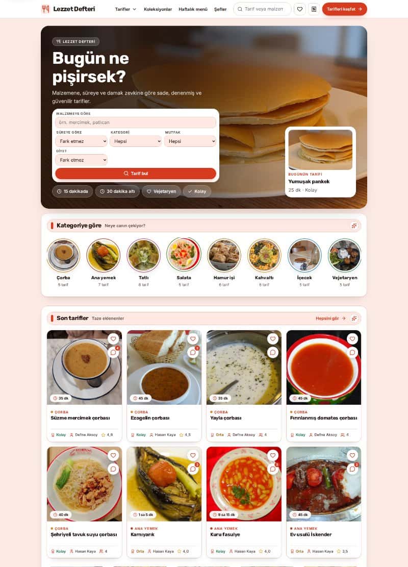
The feeling a color evokes changes with the colors around it, the industry and the culture of the audience. Green may suggest naturalness in a health brand and growth on a finance site. So instead of searching for the best color, define your brand personality: serious or friendly, innovative or traditional?
General associations help but are not absolute
Common perceptions can guide you; treat them only as a starting point.
- Blue: often linked to trust, calm and corporate tone.
- Green: can suggest nature, health, balance and growth.
- Red and orange: used for energy, urgency and attention.
- Black and dark tones: create a feeling of prestige and simplicity.
- Yellow: suggests liveliness and optimism but needs care for readability.
A simple way to build a palette
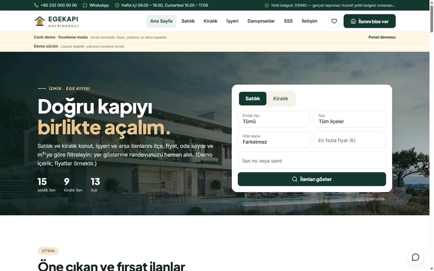
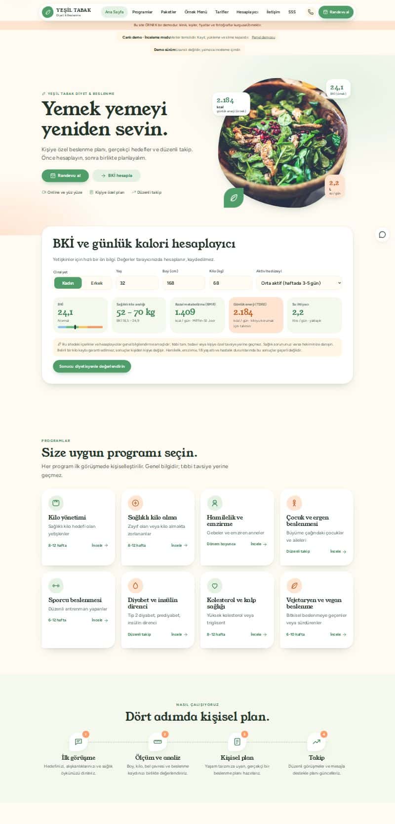
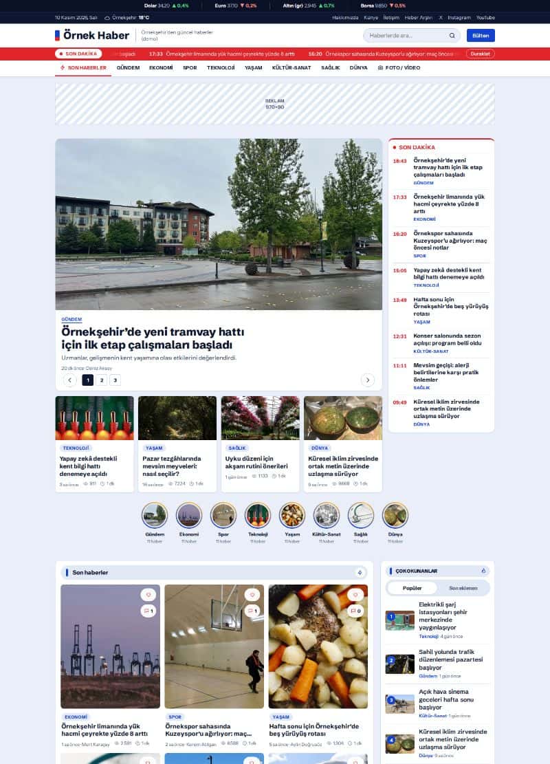
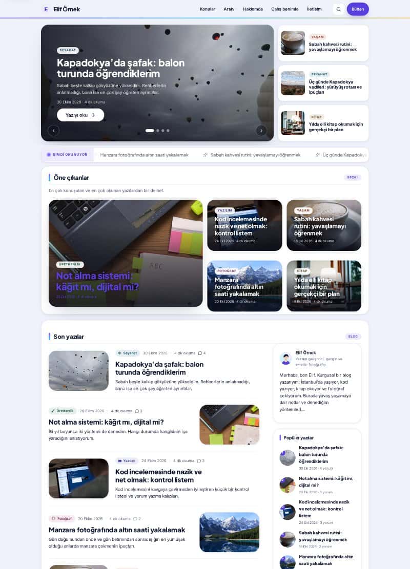
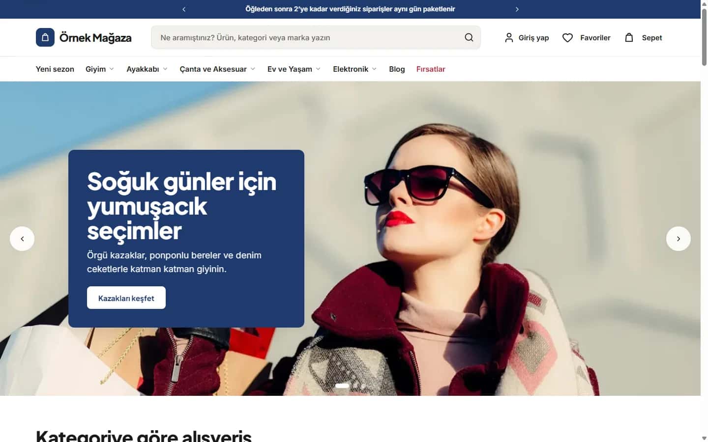
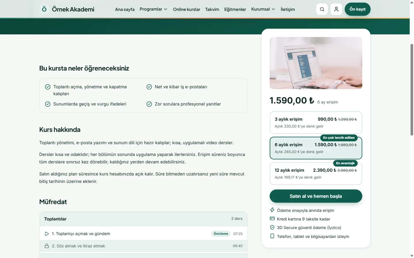
Three groups of color are enough for most sites: a primary color, an accent color and neutrals. The primary color carries identity. The accent is used for action elements such as buttons. Neutrals are for backgrounds and text. Too many colors make a page look scattered and less professional.
Contrast and readability
A combination that looks nice but cannot be read is useless. Text needs enough contrast against its background; white text on light gray is unreadable, especially on mobile in sunlight. Test your palette with free tools that measure WCAG contrast ratios.
Color in call-to-action buttons
A button color should stand apart from other elements while staying inside the brand palette. If you use a single accent color only for action elements, visitors intuitively learn where to click. Highlighting everything means highlighting nothing.
Remember color blindness
Some users cannot distinguish certain colors. Do not convey information by color alone: in error states, add an icon and explanatory text besides red, and label chart data. This improves accessibility as well as general usability.
Light and dark theme harmony
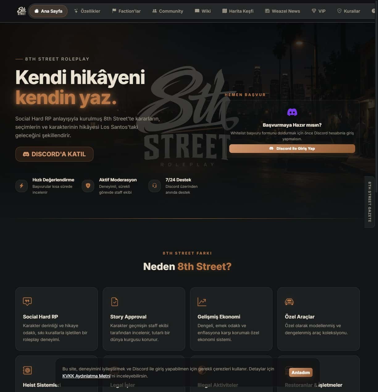
If your site has a dark mode, check your colors on both backgrounds separately. A primary color that looks strong on light may be too bright or too faint on dark. If needed, prepare a version of the palette tuned for the dark theme.
Your own test and decision
Try a few palette candidates on real page mockups, not just swatches. Collect feedback from people around you and your target audience, then write the chosen colors into a brand guide so logo, social media and printed material stay consistent.
If you would like support deciding what to do with your site, get in touch or browse our services.